Mission ->To reimagine a toy store inspired by childhood camp nostalgia.
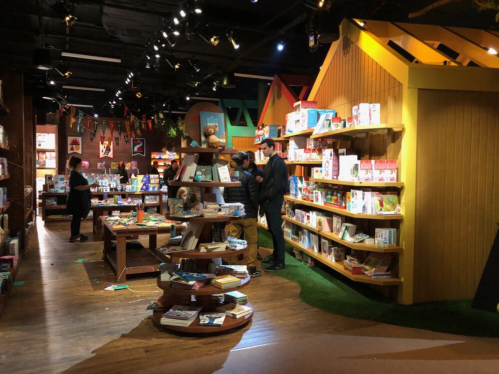
Behind the secret door of a seemingly ordinary canteen lies Camp—a new-generation toy store in NYC’s Flatiron District.
For a long time, traditional toy stores have struggled to stay alive due to their uninspiring model of having customers shop in sterile, icy warehouses—especially when paired with poor customer support, if any. Modern customers are attracted to building brand relationships and being part of the story. No breadth of inventory these days can overcome the lack of customer engagement.
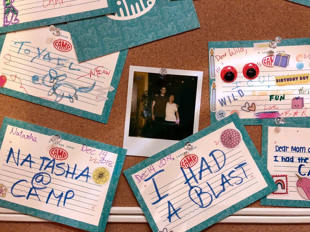
Camp wanted to try something new. Not only did they want customers to have the latest and greatest merchandise but also to be part of the retail space’s narrative. At Camp, customers are encouraged to roam, play, and interact with the environment and staff. They believe the retail experience should be a dialogue between the space and its users. And that is precisely what we set out to make.
OkiDoki and I teamed up to transform Camp’s 10,000-square-foot space into an intricate labyrinth of play. We wanted to create, from the ground up, a shopping experience that takes kids and parents back in time to a faraway land of complete camp nostalgia.
Camp opened its doors on December 15, 2018.
Retail Experience
Design, Strategy, Illustration, 3D Modeling | Edmund Liang
Studio | OkiDoki

Press


Design Process
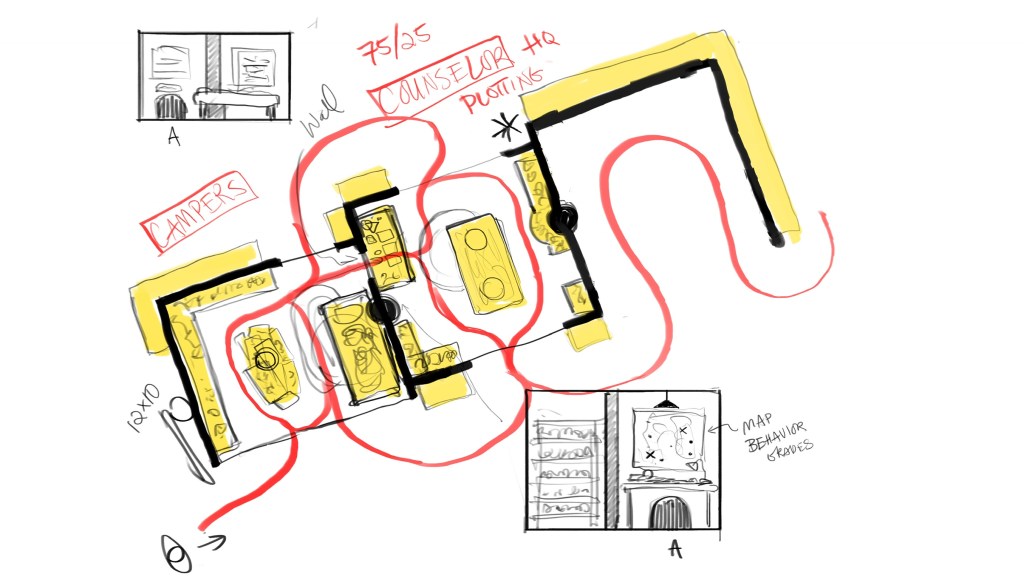
With all projects, I like to begin with broad strokes. The team had ideas but nothing was concrete—which is how most projects typically begin. Over time, I identify patterns, motivations, which ultimately led us to a clearer and clearer understanding of the space’s purpose or “function”. This function is then used to shape the “form”. Below, you’ll find the initial blueprint that everything started from.
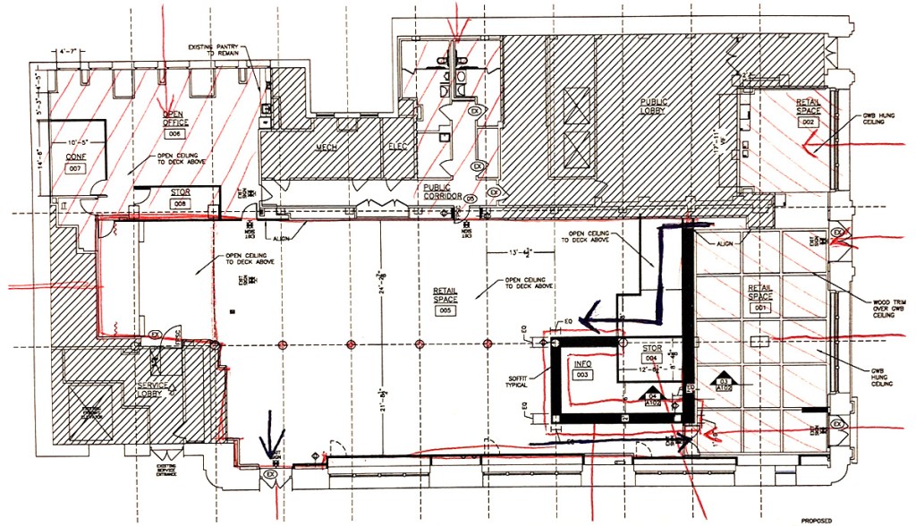
Blueprint
Blueprint
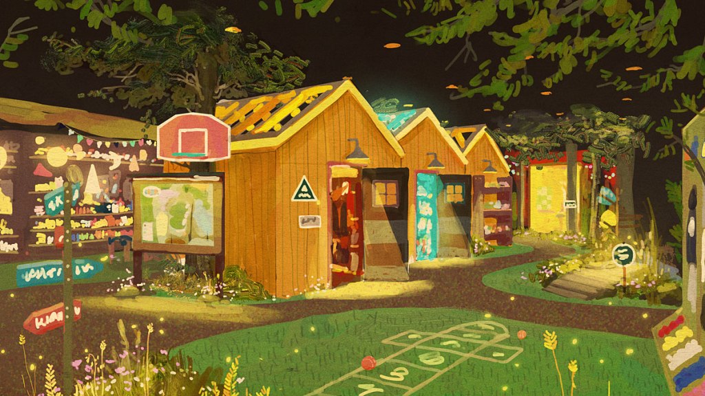
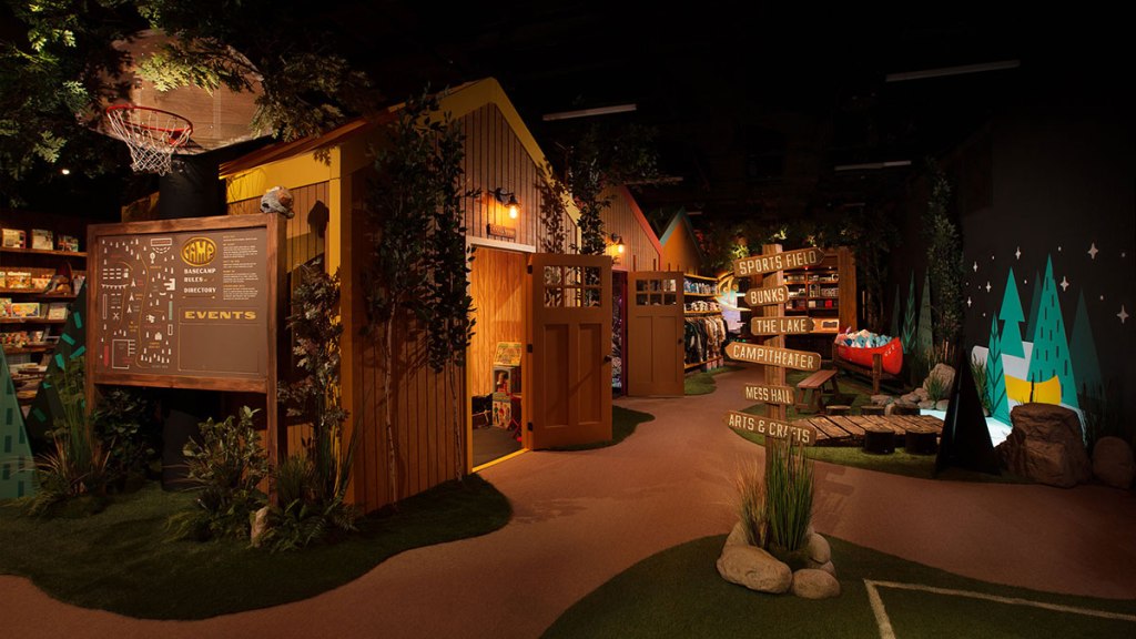
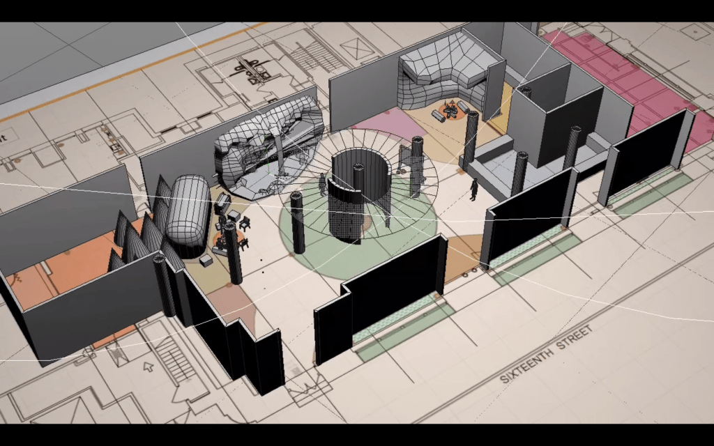
Establishing Shot
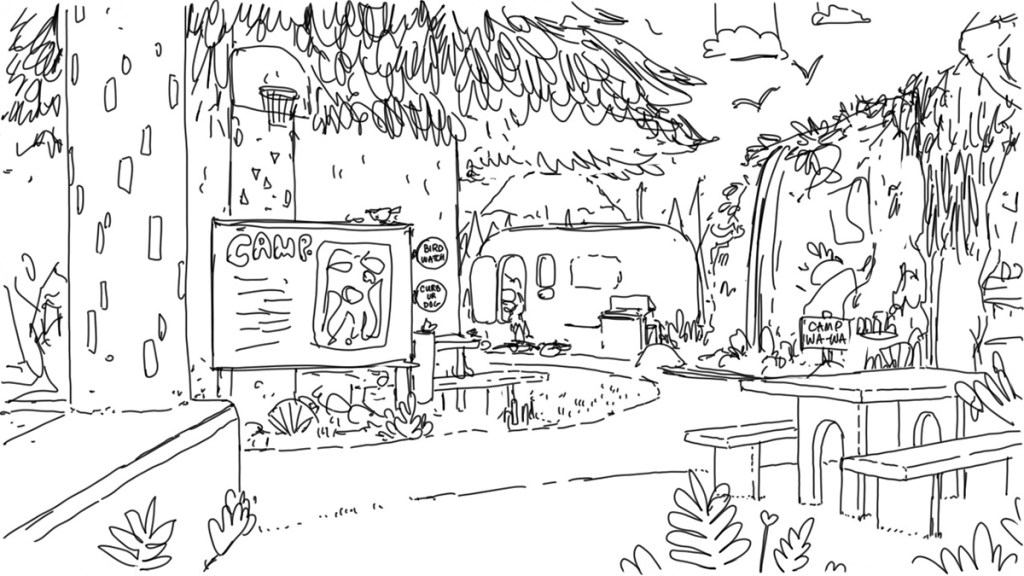
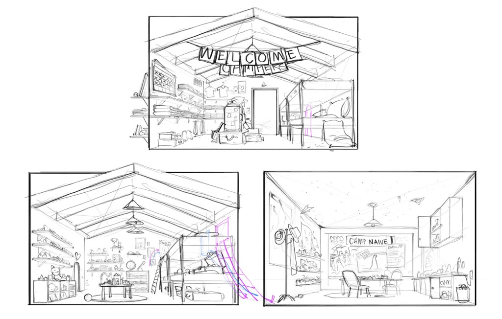
We wanted to explore what customers see when we walk past the initial “portal” experience. This is the equivalent of Alice, in Alice in Wonderland, when she lands in the dream world after descending down the rabbit hole.
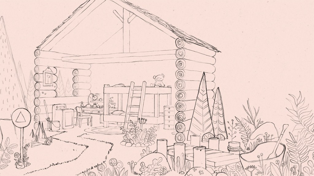
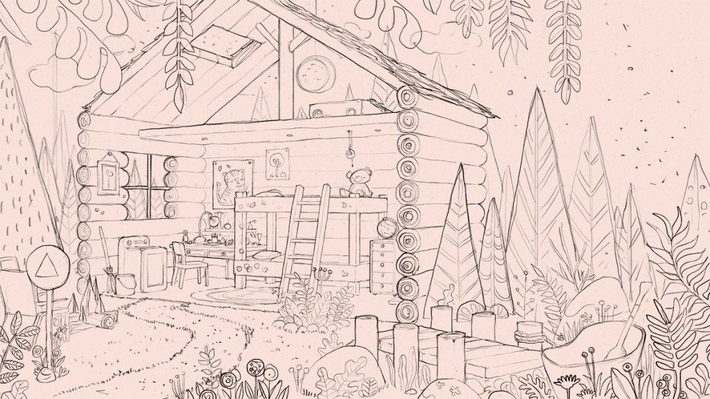
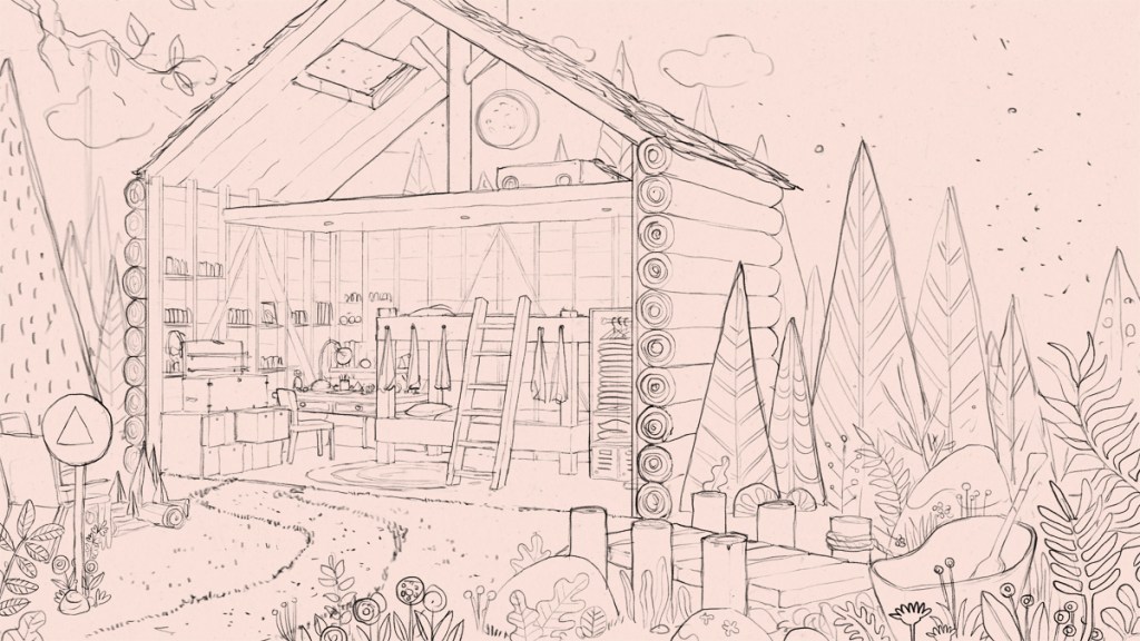
Concept Sketch
Concept Sketch
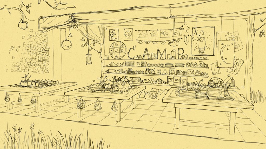
Concept Sketch / A space to kids to play and get messy.
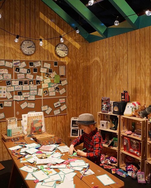
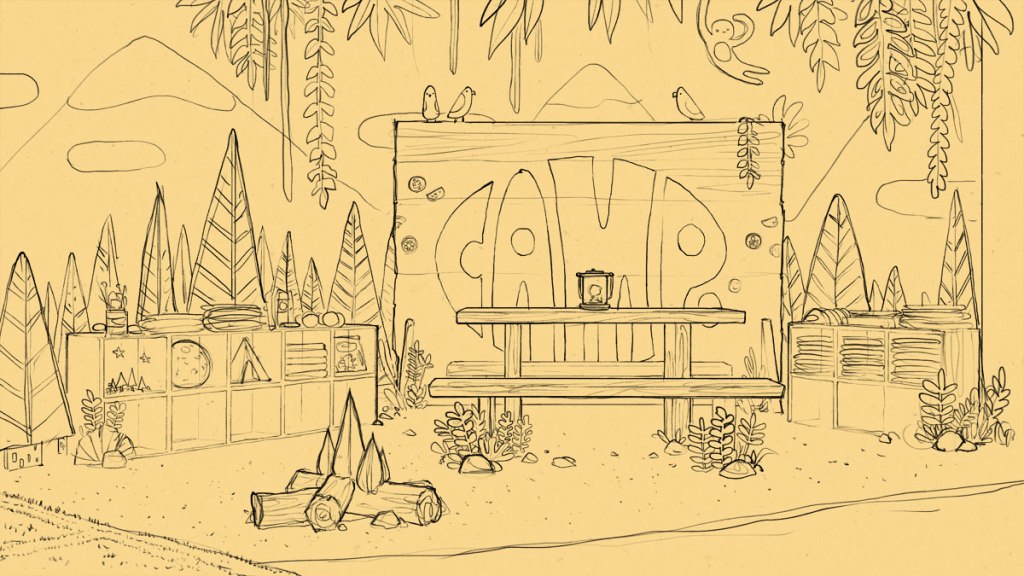
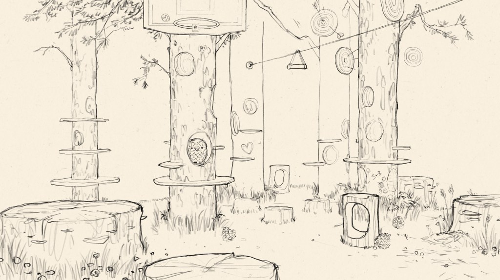
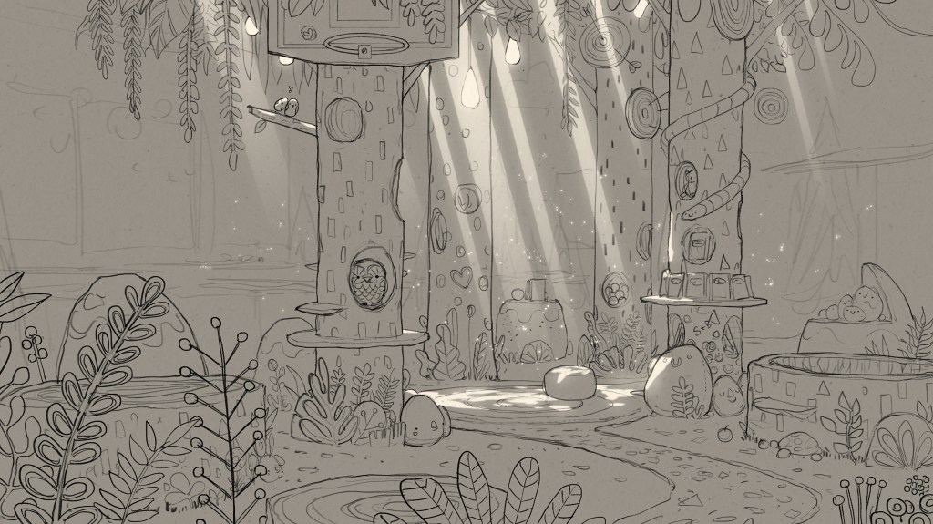
The Grove
Below is what CAMP calls The Grove. Inspired by light-dappled forest clearings, this area was at the heart of the store. We envisioned it being filled with hidden “easter eggs”. Our goal was to creatively conceal merchandise throughout and have kids embark on a treasure hunt guided by sensory cues.
Designing Merchandise Display
It’s a whole new way of thinking when designing for kids. We had to be in their minds—something we adults haven’t experienced for decades.
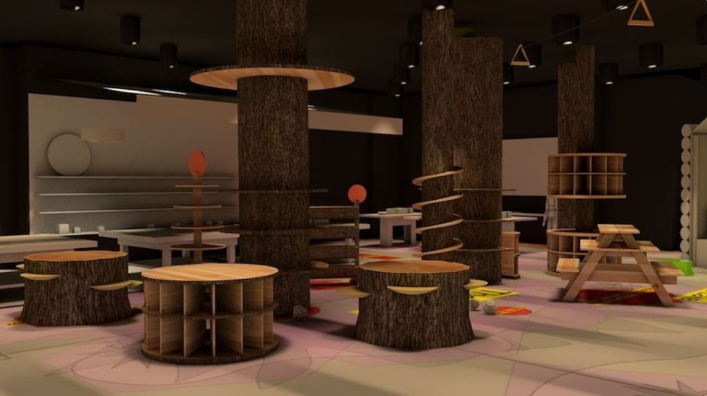
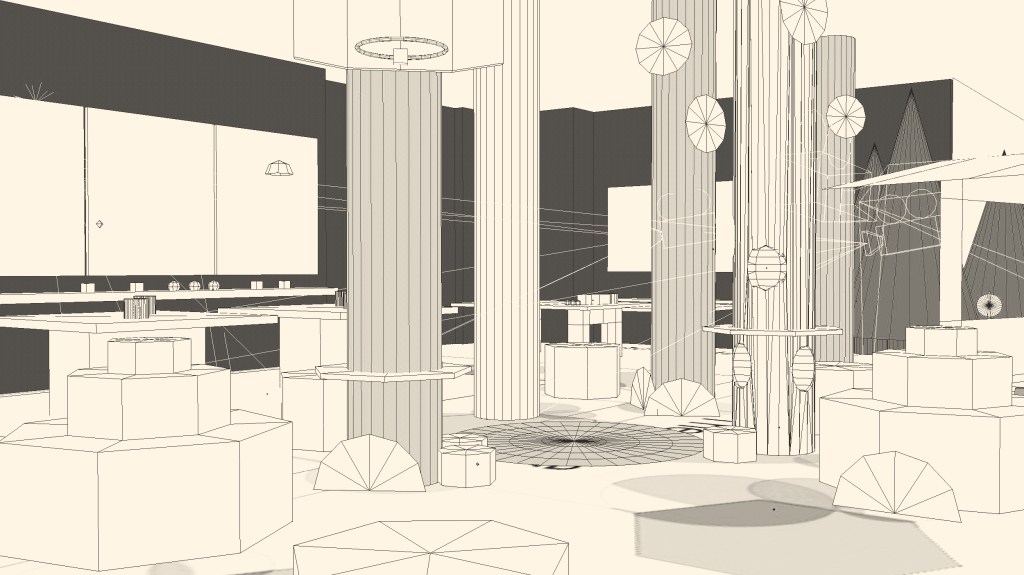
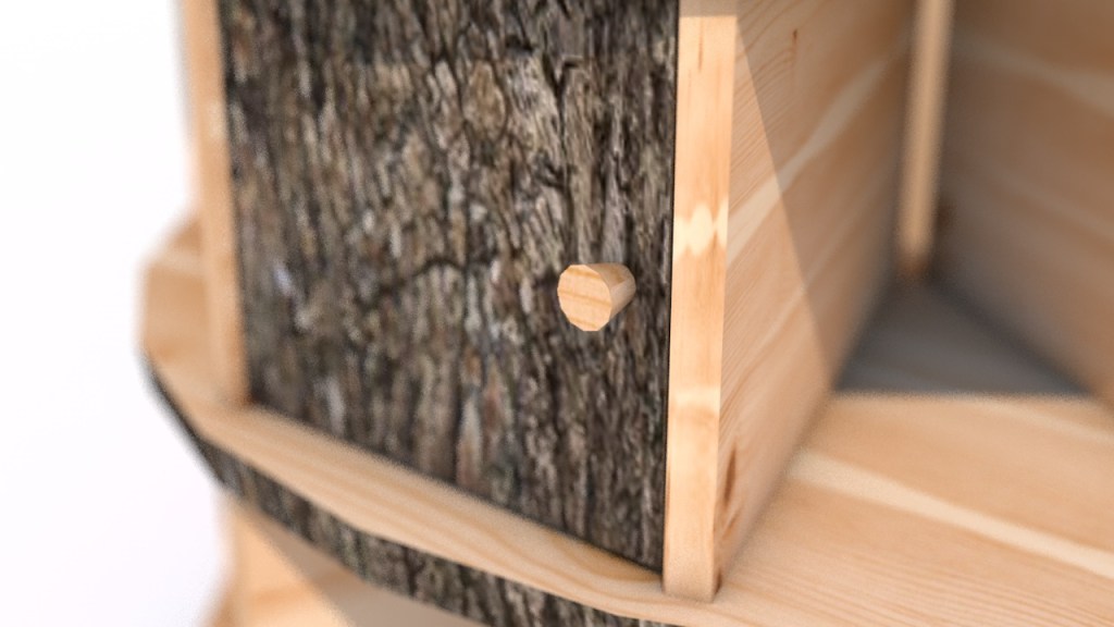
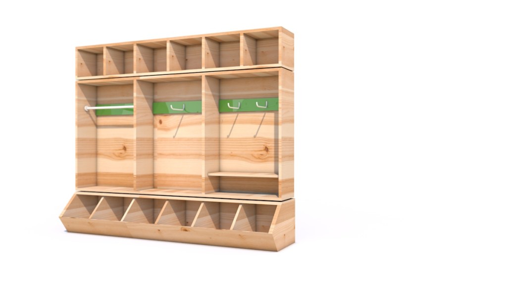
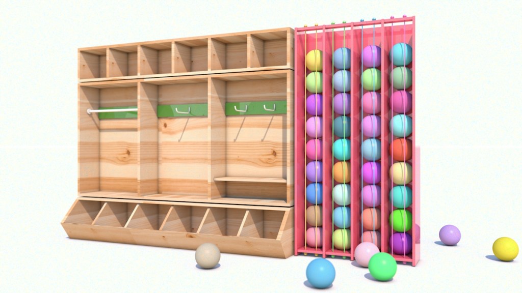
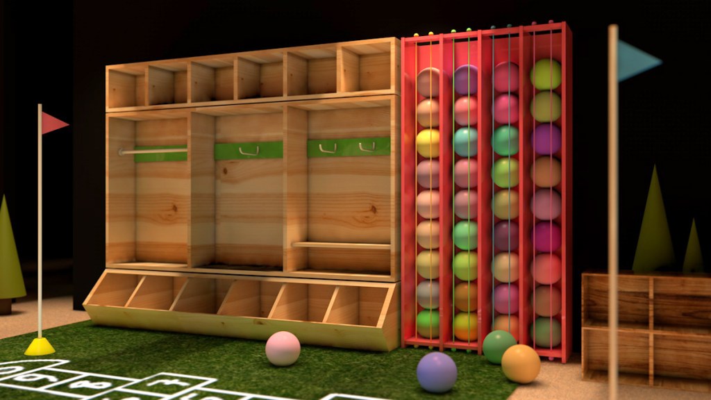
3D Model / After I designed and modeled all the shelving systems, I tested them in 3D.
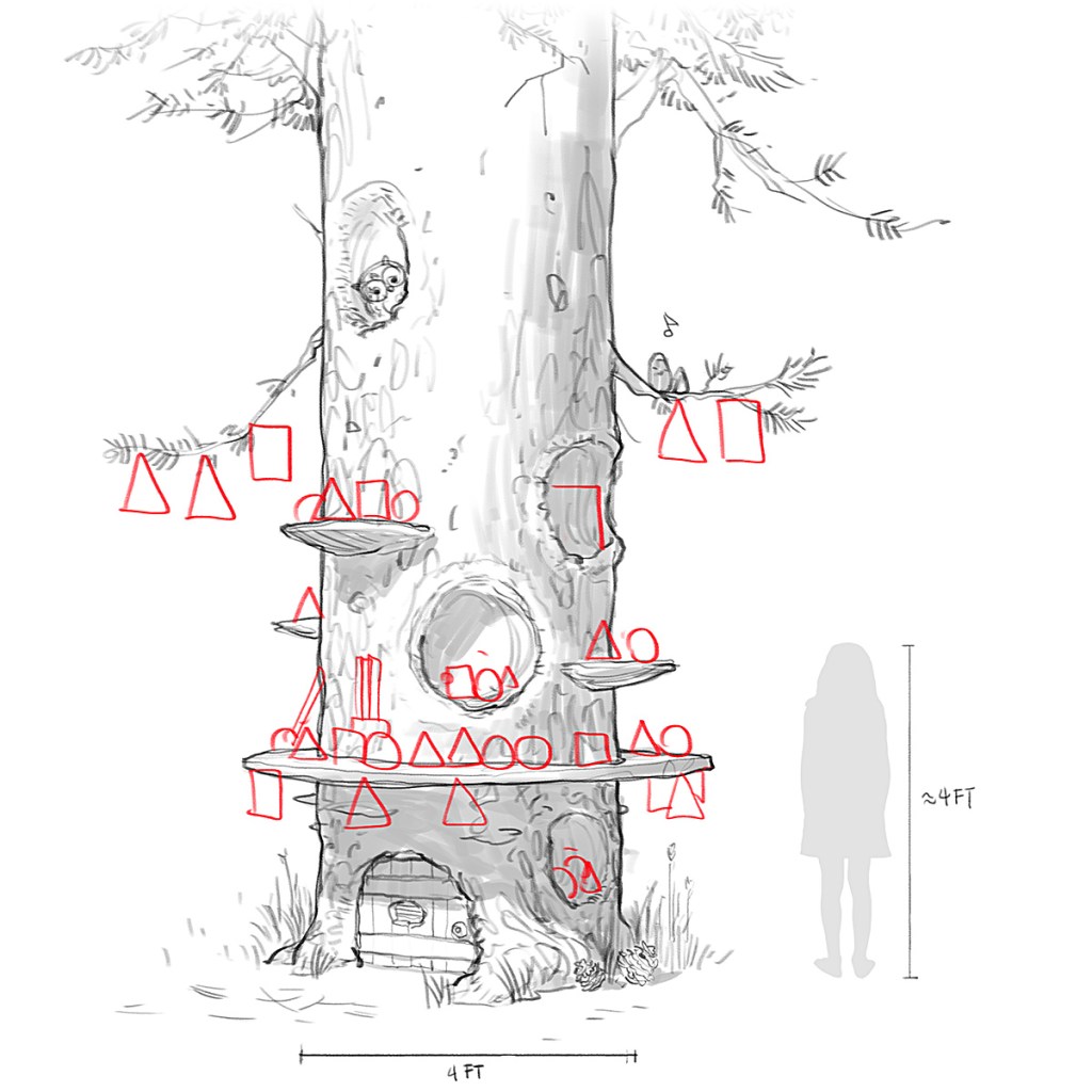
Concept Sketch / How do we disguise fixed elements (like columns), stay within theme, and display merch?
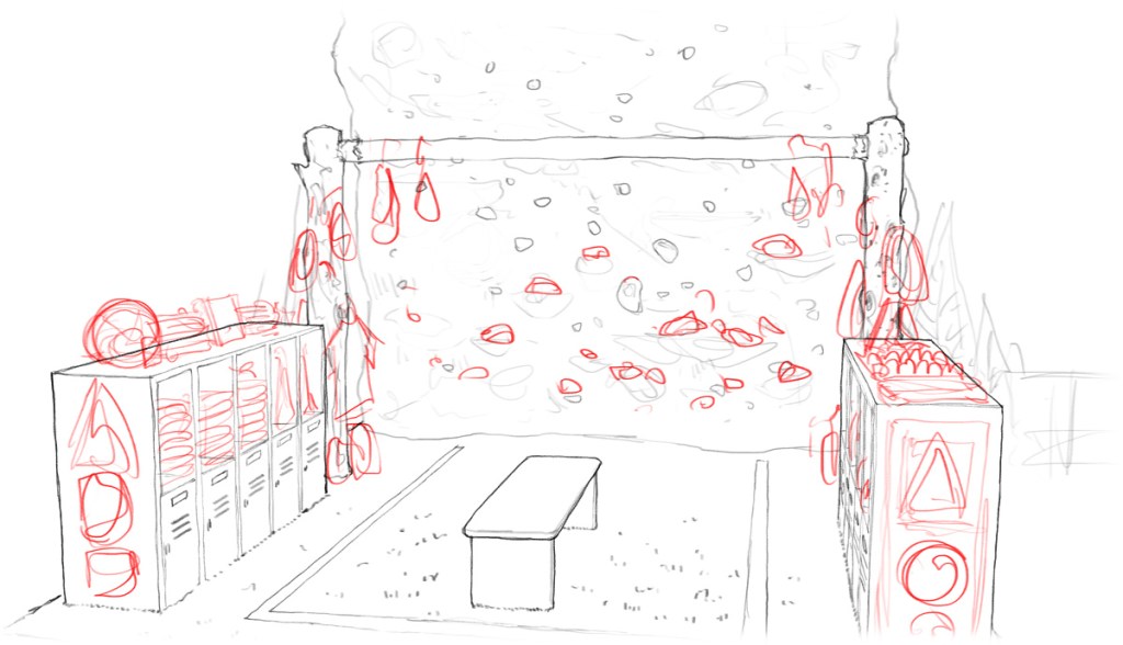
Concept Sketch
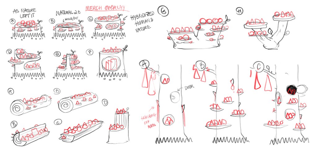
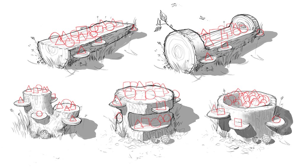
Concept Sketch / Infinite possibilities.
Concept Sketch / How can we get creative with low-height merch displays?
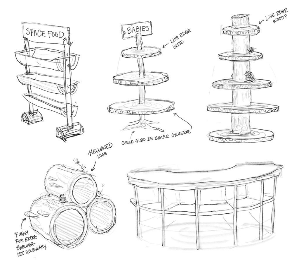
Concept Sketch / Movable shelving designed to be accessed from all sides.
Concept Sketch / Building low-poly 3D models to previzualize textures, materials, smells, sounds, and ergonomics.
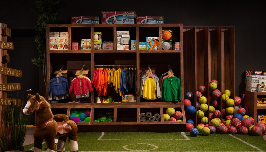
Final Result / Designing a custom shelving system that can hold all these toys.
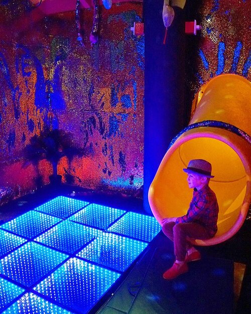
Other Microzones
Big or small, each zone of the store had to be carefully considered. We wanted to be intentional with every cubic feet.
Concept Sketch / Figuring out flow of foot traffic.
Concept Sketch / Variations Upon Variations You never know. What if another options works better?
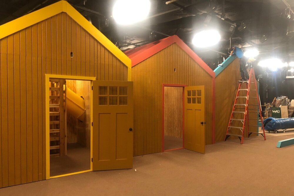
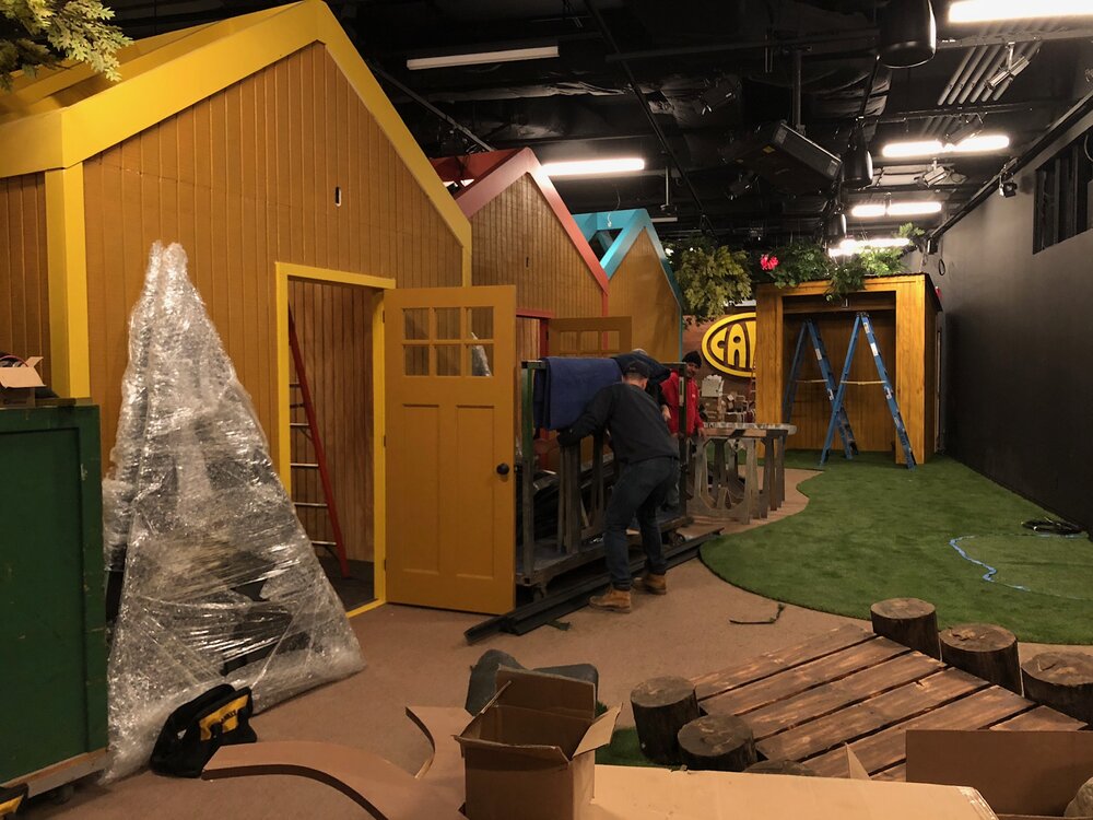
Production
Nothing compares to seeing the real thing being built!